Home Blog Page 3

jQuery Bootgrid – simple and powerful Grid Control for Bootstrap to extend tables with responsive web design with minimum code change

jQuery Bootgrid – simple and powerful Grid Control for Bootstrap to extend tables  with responsive web design with minimum code change

Nice, sleek and intuitive. A grid control especially designed for bootstrap.

jQuery Bootgrid is a powerful table extender if you will. It extends your table with nice and helpful features as you will see right below. Check out the demos here and get a first-hand impression!

There are two ways to populate jQuery Bootgrid. Either you use the server-side way (e.g. a REST service) for querying a dynamic data source like a database or you use the client-side way for simple in-memory data visualization.

Add data-toggle="bootgrid" to your table to initialize jQuery Bootgrid without writing any line of JavaScript code.

http://www.jquery-bootgrid.com/Documentation

Features

Responsive web design
Mobile devices are more and more important and time is rare. So developing one website for all devices is the right solution to keep development time and cost low.
Accessability support
Make it visible for everyone without extra work – just use it.
Server-side data loading (async)
Load your data asynchronously via AJAX by calling e.g. aREST service.
Dynamic Manipulation
Append, clear or remove rows dynamically via API.
Easy Navigation
A powerful pagination & search field helps you to navigate through your data easily.
Bootstrap support
The default styling is based on Bootstrap.
Flexible design
You are the designer and it´s completely up to you how you style your table.
Highly configurable
Everything is configurable & the plugin is completely based on templates which can be customized.
Data API
All settings can be also set by data attributes.
Client-side data loading (in-memory)
Turn your basic table into a table with advanced functionality (e.g. sorting, paging, searching and much more).
Column converters & formatters
For more flexibility.
Single & multiple row selection support
Today interaction is everywhere needed and selection is such kind of feature that helps you doing this.
Localization support
Labels can be easily changed.

Website: http://www.jquery-bootgrid.com/

Examples: http://www.jquery-bootgrid.com/Examples

Documentation: http://www.jquery-bootgrid.com/Documentation


Thanks for reading,
Web Editor

Sweet Alert – A sleek replacement for java script “ALERT” function

Sweet Alert – A sleek replacement for java script “ALERT” function

Pretty cool huh? SweetAlert automatically centers itself on the page and looks great no matter if you’re using a desktop computer, mobile or tablet. It’s even highly customizable, as you can see below


CONFIGURATION

Here are the keys that you can use if you pass an object into sweetAlert:


Argument

Default value
 

Description

title null (required) The title of the modal. It can either be added to the object under the key “title” or passed as the first parameter of the function.
text null A description for the modal. It can either be added to the object under the key “text” or passed as the second parameter of the function.
type null The type of the modal. SweetAlert comes with 4 built-in types which will show a corresponding icon animation: “warning“, “error“, “success” and “info”. You can also set it as “input” to get a prompt modal. It can either be put in the object under the key “type” or passed as the third parameter of the function.
allowEscapeKey true If set to true, the user can dismiss the modal by pressing the Escape key.
customClass null A custom CSS class for the modal. It can be added to the object under the key “customClass”.
allowOutsideClick false If set to true, the user can dismiss the modal by clicking outside it.
showCancelButton false If set to true, a “Cancel”-button will be shown, which the user can click on to dismiss the modal.
showConfirmButton true If set to false, the “OK/Confirm”-button will be hidden. Make sure you set a timer or set allowOutsideClick to true when using this, in order not to annoy the user.
confirmButtonText “OK” Use this to change the text on the “Confirm”-button. If showCancelButton is set as true, the confirm button will automatically show “Confirm” instead of “OK”.
confirmButtonColor “#AEDEF4” Use this to change the background color of the “Confirm”-button (must be a HEX value).
cancelButtonText “Cancel” Use this to change the text on the “Cancel”-button.
closeOnConfirm true Set to false if you want the modal to stay open even if the user presses the “Confirm”-button. This is especially useful if the function attached to the “Confirm”-button is another SweetAlert.
closeOnCancel true Same as closeOnConfirm, but for the cancel button.
imageUrl null Add a customized icon for the modal. Should contain a string with the path to the image.
imageSize “80×80” If imageUrl is set, you can specify imageSize to describes how big you want the icon to be in px. Pass in a string with two values separated by an “x”. The first value is the width, the second is the height.
timer null Auto close timer of the modal. Set in ms (milliseconds).
html false If set to true, will not escape title and text parameters. (Set to false if you’re worried about XSS attacks.)
animation true If set to false, the modal’s animation will be disabled. Possible (string) values : pop (default when animation set to true), slide-from-top, slide-from-bottom
inputType “text” Change the type of the input field when using type: “input” (this can be useful if you want users to type in their password for example).
inputPlaceholder null When using the input-type, you can specify a placeholder to help the user.
inputValue null Specify a default text value that you want your input to show when using type: “input”
showLoaderOnConfirm false Set to true to disable the buttons and show that something is loading.

METHODS

SweetAlert also comes with some simple methods that you can call:


Function

Example
 

Description

setDefaults swal.setDefaults({ confirmButtonColor: ‘#0000’ }); If you end up using a lot of the same settings when calling SweetAlert, you can use setDefaults at the start of your program to set them once and for all!
close swal.close(); Close the currently open SweetAlert programatically.
showInputError swal.showInputError(“Invalid email!”); Show an error message after validating the input field, if the user’s data is bad
enableButtons, disableButtons swal.disableButtons(); Disable or enable the user to click on the cancel and confirm buttons.

Website: http://t4t5.github.io/sweetalert/


Thanks for reading,
Web Editor

PACE – Automatic page load progress bar which monitors AJAX requests, Event loop lag and documents ready state.

PACE – Automatic page load progress bar which monitors AJAX requests, Event loop lag and documents ready state.

Include pace.js and a CSS theme of your choice, and you get a beautiful progress indicator for your page load and ajax navigation.

No need to hook into any of your code, progress is detected automatically.

Pace will automatically monitor your ajax requests, event loop lag, document ready state, and elements on your page to decide the progress. On ajax navigation it will begin again!

If you use AMD or Browserify, require in pace.js and call pace.start() as early in the loading process as is possible.

Example

<head>
  <script src="/pace/pace.js"></script>
  <link href="/pace/themes/pace-theme-barber-shop.css" rel="stylesheet" />
</head>

Configuration

Pace is fully automatic, no configuration is necessary to get started.

If you would like to make some tweaks, here’s how:

You can set window.paceOptions before bringing in the file:

paceOptions = {
  // Disable the 'elements' source
  elements: false,

  // Only show the progress on regular and ajax-y page navigation,
  // not every request
  restartOnRequestAfter: false
}

You can also put options on the script tag:

<script data-pace-options='{ "ajax": false }' src='pace.js'></script>

If you’re using AMD or Browserify, you can pass your options to start:

define(['pace'], function(pace){
  pace.start({
    document: false
  });
});


Website: http://github.hubspot.com/pace/docs/welcome/


Thanks for reading,
Web Editor


Parsley – Powerful JavaScript based form validation library with lots of built-in validators

Parsley – Powerful JavaScript based form validation library with lots of built-in validators

Parsley, Powerful JavaScript form validation library

Validating forms frontend have never been so powerful and easy.

Intuitive DOM API

Like no other form validation library, simply write in English your requirements inside your form HTML tags, Parsley will do the rest! No need to write even a single JavaScript line for simple form validation.

View example »

Dynamic form validation

Parsley is now smarter, it automatically detects your forms’ modifications and adapts its validation accordingly. Simply add, remove or edit fields, Parsley validation will follow!

View example »

Tons of built-in validators

Parsley is shipped with more than a dozen useful validators. If not enough, use the awesome Parsley extra Ajax validator or tons of other extended validators provided by the community.

View details »

UX focused

Parsley strongly focuses on #UI and #UX. Override almost every Parsley default behavior to fit yourexact needs.

View documentation »

Super reliable

Still shipped almost bug free. Parsley is strongly tested, and aimed to work on every browser since IE7.

View tests »

Free

Parsley is Open Source, MIT licensed, and developed to help everyone. It will stay that way. Join us on Github!

View license »

Built-in validators

Overview

A validator is a method to determine if a given value (or sometimes sets of values) is acceptable or not, given some requirement parameters.

Parsley comes with many builtin validators and provides tools to specify your own.

Builtin validators list

Name API Description
Required #2.0
required HTML5
data-parsley-required
data-parsley-required="true"
data-parsley-required="false"
Validates that a required field has been filled with a non blank value. If data-parsley-required="false", validator is deactivated and the field is not required.
Email #2.0
type="email" HTML5
data-parsley-type="email"
Validates that a value is a valid email address.
Number #2.0 data-parsley-type="number" Validates that a value is a valid number.Warning!HTML5 type="number" is bound with the belowinteger validator, but for browsers that support it, the value accessible from javascript in case of invalid input is "", so you will never get an error (unless it is alsorequired).
Integer #2.0
type="number" HTML5
data-parsley-type="integer"
Validates that a value is a valid integer.
Digits #2.0 data-parsley-type="digits" Validates that a value is only digits.
Alphanum #2.0 data-parsley-type="alphanum" Validates that a value is a valid alphanumeric string.
Url #2.0
type="url" HTML5
data-parsley-type="url"
Validates that a value is a valid url.
Minlength #2.0
minlength="6" HTML5
data-parsley-minlength="6"
Validates that the length of a string is at least as long as the given limit.
Maxlength #2.0
maxlength="6" HTML5
data-parsley-maxlength="6"
Validates that the length of a string is not longer than the given limit.
Length #2.0 data-parsley-length="[6, 10]" Validates that a given string length is between some minimum and maximum value.
Min #2.0
min="6" HTML5
data-parsley-min="6"
Validates that a given number is greater than or equal to some minimum number.
Max #2.0
max="10" HTML5
data-parsley-max="6"
Validates that a given number is less than or equal to some maximum number.
Range #2.0
type="range" HTML5
data-parsley-range="[6,10]"
Validates that a given number is between some minimum and maximum number.
Pattern #2.0
pattern="\d+" HTML5
data-parsley-pattern="\d+"
Validates that a value matches a specific regular expression (regex).
MinCheck #2.0 data-parsley-mincheck="3" Validates that a certain minimum number of checkboxes in a group are checked.
MaxCheck #2.0 data-parsley-maxcheck="3" Validates that a certain maximum number of checkboxes in a group are checked.
Check #2.0 data-parsley-check="[1, 3]" Validates that the number of checked checkboxes in a group is within a certain range.
Equalto #2.0 data-parsley-equalto="#anotherfield" Validates that the value is identical to another field’s value (useful for password confirmation check).

These validators are shipped in parsley.js. Have a look at the Parsley Remote plugin and Parsley Extras for more validators.

Custom Validators

Craft yours

Of course, Parsley built-in validators are commonly used validators, and you’ll need some more that fit your specific forms and validations. That’s why Parsley lets you easily create your own validators.

The preferred way to register them (after parsley.js is loaded) looks like:

<input type="text" data-parsley-multipleof="3" />
[...]
<script type="text/javascript">
window.Parsley
  .addValidator('multipleof', {
    requirementType: 'integer',
    validateNumber: function(value, requirement) {
      return 0 === value % requirement;
    },
    messages: {
      en: 'This value should be a multiple of %s',
      fr: 'Cette valeur doit être un multiple de %s'
    }
  );
</script>

The following sections go over the details on how to define a custom validator

Validating function

There are many ways a validator can specify how to validate data:

Name Description
validateString Is passed the input’s value as a string.
validateNumber Use this instead of validateString when only numeric values are acceptable. Parsley will parse the input’s value and pass the number, or reject the value if it’s not an acceptable number
validateMultiple Is passed an array of values, in the case of checkboxes.

Your custom validator must specify at least one of these. If it can validate both single inputs and multiple (i.e. checkboxes), then you can specify validateMultiple and one of the other two.

Validating functions should return either true if the value is valid, or false otherwise. It can instead return a promise that will be resolved if the value is valid, or be rejected otherwise.

Requirement parameters

You can specify what kind of requirement parameter your custom validator is expecting:

requirementKind Description
string The most generic kind; requirement passed as is, with no checking.
integer For integers only (e.g. used by minlength)
number To be used when decimal numbers are acceptable
regexp Requirement can be either a full regexp string (e.g. /hel+o/i) or just a simple expression (e.g. hel+o)
boolean Any value other than "false" will be considered to true, including the empty string. This is so data-parsley-required and data-parsley-required=true be treated the same way.

You can also specify an array of these kinds. For example, if a validator has requirementKind: ['integer', 'integer'], then given the requirement string "[1, 2]" it will receive 1 and 2 as second and third arguments (the first one being the value(s) to validate).

For even cases where more complex parameters are needed, you can specify extra parameters; refer to the source and check how the remote validator uses that.

Error messages

You can specify error messages, in as many locales as desired, using the messages option.

This is equivalent to calling addMessage for each locale.

Parsley Extras

You’ll find in the src/extra/ directory in Parsley .zip or Github projects many more or less useful validators crafted by the community. A doc here is coming.

Validators list

Name API Description
Greater than #2.0
data-parsley-gt="#anotherfield"
data-parsley-gt="6"
Validates that the value is greater than another field’s value or some strict minimum number.
Greater than or equal to #2.0
data-parsley-gte="#anotherfield"
data-parsley-gte="6"
Validates that the value is greater than or equal to another field’s value or some minimum number.
Less than #2.0
data-parsley-lt="#anotherfield"
data-parsley-lt="6"
Validates that the value is less than another field’s value or some strict maximum number.
Less than or equal to #2.0
data-parsley-lte="#anotherfield"
data-parsley-lte="6"
Validates that the value is less than or equal to another field’s value or some minimum number.
Minwords #2.0
data-parsley-minwords="200"
Validates that the value have at least a certain amount of words
Maxwords #2.0
data-parsley-maxwords="200"
Validates that the value have a maximum of a certain amount of words
Words #2.0
data-parsley-words="[200, 600]"
Validates that the value is within a certain range of words

Website:http://parsleyjs.org/

Examples: http://parsleyjs.org/doc/examples.html


Thanks for reading,
Web Editor

Material Design Iconic Font created and maintained by Google for easy scalable vector graphics on websites.

graphics on websites.

Material Design Iconic Font is a full suite of material design icons (created and maintained by Google) for easy scalable vector graphics on websites.

The complete set of 744 icons in Material Design Iconic Font.

Following categories of icons are available for websites:

Web Application
Notifications
Person
File
Editor
Comment
Form
Hardware
Directional
Map
View
Date / Time
Social
Image
Audio / Video
Numbers

Setting up MD Iconic Font can be as simple as adding one line of code to your website – it’s likeFont Awesome but with Material Design by Google. Also it plays nicely with Bootstrap 3!

EASY: CSS on CDNjs

Thanks to the cdnjs.cloudflare.com, you can use CDNjs to add MD Iconic Font into your website without downloading or installing anything!

  1. Paste the following code into the <head> section of your site’s HTML. 
    • code
    • source
    1. <link rel=“stylesheet” href=”https://cdnjs.cloudflare.com/ajax/libs/material-design-iconic-font/2.1.2/css/material-design-iconic-font.min.css”>

     Immediately after release, it takes a bit of time for CDNjs to catch up and get the newest version live on their CDN.

  2. Check out the examples to start using Material Design Iconic Font!

BASIC: Default CSS

Use this method to get the default Material Design Iconic Font CSS.

  1. Download latest version of Material Design Iconic Font from this site or GitHub.
  2. Unpack the entire material-design-iconic-font archive into your project.
  3. In the <head> of your html, reference the location to your material-design-iconic-font.min.css. 
    • code
    • source
    1. <link rel=“stylesheet” href=”path/to/material-design-iconic-font/css/material-design-iconic-font.min.css”>
  4. Check out the examples to start using Material Design Iconic Font!

PRO: Custom LESS or SCSS

Use this method to customize Material Design Iconic Font using LESS or SCSS.

  1. Download source of Material Design Iconic Font from GitHub.
  2. Open your project’s path/to/material-design-iconic-font/less/variables.less or path/to/material-design-iconic-font/scss/_variables.scss and edit the @md-font-path variable to point to your font directory. 

     The font path is relative from your compiled CSS directory.

  3. Re-compile your LESS or SCSS if using a static compiler.
  4. Check out the examples to start using Material Design Iconic Font!
  • Chrome 21+
  • Firefox 22+
  • Opera 12.1+
  • Safari 6.1+
  • IE 10+
  • Android Browser 4.3+
  • Not supported in Opera Mini

In fact it can work in earlier versions of browsers accordingly to caniuse.com portal (you can check ttf, woff, transform and animation properties), but I can’t test it.


Website: http://zavoloklom.github.io/material-design-iconic-font/index.html

Examples / Demo: http://zavoloklom.github.io/material-design-iconic-font/examples.html

Icons categories: http://zavoloklom.github.io/material-design-iconic-font/icons.html


Thanks,
Web Editor


Awesome Bootstrap Checkbox – CSS based Checkbox and Radio plugin.

Awesome Bootstrap Checkbox – CSS based Checkbox and Radio plugin

Font Awesome Bootstrap Checkboxes & Radios plugin. Pure css way to make inputs look prettier. No javascript!


Use

First just include awesome-bootstrap-checkbox.css somewhere in your html. Or awesome-bootstrap-checkbox.scss if you use sass. Next everything is based on code convention. Here is checkbox markup from Bootstrap site:

<form role="form">
  ...
  <div class="checkbox">
    <label>
      <input type="checkbox"> Check me out
    </label>
  </div>
  ...
</form>

We have to alter it a bit:

<form role="form">
  ...
  <div class="checkbox">
    <input type="checkbox" id="checkbox1">
    <label for="checkbox1">
        Check me out
    </label>
  </div>
  ...
</form>

That’s it. It will work. But it will not work if you nest input inside label or put label before input.

If you want to enable Opera 12 and earlier support just add class styled to input element:

...
<input type="checkbox" id="checkbox1" class="styled">
...

Browser support

  • Firefox (3.6+)
  • Chrome (14+)
  • IE (9+)
  • Opera (11.6+)
  • Safari (6+)

Radios

It’s the same for radios. Markup has to be the following:

<form role="form">
  ...
  <div class="radio">
      <input type="radio" name="radio2" id="radio3" value="option1">
      <label for="radio3">
          One
      </label>
  </div>
  <div class="radio">
      <input type="radio" name="radio2" id="radio4" value="option2" checked>
      <label for="radio4">
          Two
      </label>
  </div>
  ...
</form>

Brand Colors and other features

You may use checkbox-primary, checkbox-danger, radio-info, etc to style checkboxes and radios with brand bootstrap colors.

checkbox-circle is for rounded checkboxes.

checkbox-single and radio-single for inputs without label text.

Glyphicons way (Opt-out Font Awesome)

If you want to use glyphicons instead of font-awesome then override .checkbox class:

.checkbox input[type=checkbox]:checked + label:after {
    font-family: 'Glyphicons Halflings';
    content: "\e013";
}
.checkbox label:after {
    padding-left: 4px;
    padding-top: 2px;
    font-size: 9px;

Website: https://github.com/flatlogic/awesome-bootstrap-checkbox

Demo: http://flatlogic.github.io/awesome-bootstrap-checkbox/demo/


Thanks for reading,
Web Editor

Bootstrap TouchSpin- A mobile and touch friendly input spinner component that supports mouse wheel and UP/DOWN keys

Bootstrap TouchSpin- A mobile and touch friendly input spinner component that supports mouse wheel and UP/DOWN keys


Settings

OPTION DEFAULT DESCRIPTION
initval "" Applied when no explicit value is set on the input with the value attribute. Empty string means that the value remains empty on initialization.
min 0 Minimum value.
max 100 Maximum value.
step 1 Incremental/decremental step on up/down change.
forcestepdivisibility 'round' How to force the value to be divisible by step value: 'none' | 'round' | 'floor' |'ceil'
decimals 0 Number of decimal points.
stepinterval 100 Refresh rate of the spinner in milliseconds.
stepintervaldelay 500 Time in milliseconds before the spinner starts to spin.
verticalbuttons false Enables the traditional up/down buttons.
verticalupclass 'glyphicon glyphicon-chevron-up' Class of the up button with vertical buttons mode enabled.
verticaldownclass 'glyphicon glyphicon-chevron-down' Class of the down button with vertical buttons mode enabled.
prefix "" Text before the input.
postfix "" Text after the input.
prefix_extraclass "" Extra class(es) for prefix.
postfix_extraclass "" Extra class(es) for postfix.
booster true If enabled, the the spinner is continually becoming faster as holding the button.
boostat 10 Boost at every nth step.
maxboostedstep false Maximum step when boosted.
mousewheel true Enables the mouse wheel to change the value of the input.
buttondown_class 'btn btn-default' Class(es) of down button.
buttonup_class 'btn btn-default' Class(es) of up button.

Events

Triggered events

The following events are triggered on the original input by the plugin and can be listened on.

EVENT DESCRIPTION
change Triggered when the value is changed with one of the buttons (but not triggered when the spinner hits the limit set bysettings.min or settings.max.
touchspin.on.startspin Triggered when the spinner starts spinning upwards or downwards.
touchspin.on.startupspin Triggered when the spinner starts spinning upwards.
touchspin.on.startdownspin Triggered when the spinner starts spinning downwards.
touchspin.on.stopspin Triggered when the spinner stops spinning.
touchspin.on.stopupspin Triggered when the spinner stops upspinning.
touchspin.on.stopdownspin Triggered when the spinner stops downspinning.
touchspin.on.min Triggered when the spinner hits the limit set by settings.min.
touchspin.on.max Triggered when the spinner hits the limit set by settings.max.

Callable events

The following events can be triggered on the original input.

Example usages:
$("input").trigger("touchspin.uponce");
$("input").trigger("touchspin.updatesettings", {max: 1000});

EVENT DESCRIPTION
touchspin.updatesettings function(newoptions): Update any setting of an already initialized TouchSpin instance.
touchspin.uponce Increase the value by one step.
touchspin.downonce Decrease the value by one step.
touchspin.startupspin Starts the spinner upwards.
touchspin.startdownspin Starts the spinner downwards.
touchspin.stopspin Stops the spinner.

Download

Download from github. Please report issues and suggestions to github’s issue tracker or contact me on g+ or twitter!


Website: http://www.virtuosoft.eu/code/bootstrap-touchspin/


Thanks for reading,
Web Editor


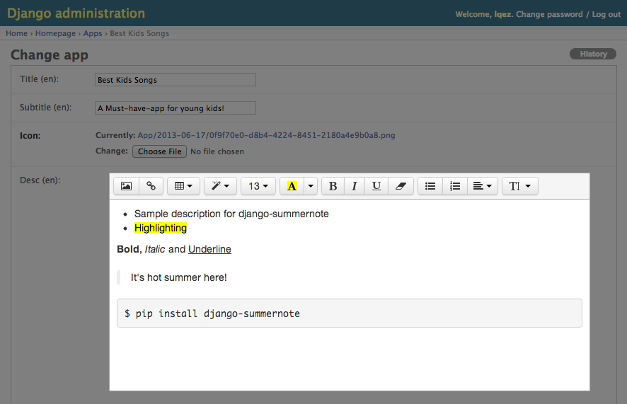
Summernote – Super Simple WYSIWYG Editor on Bootstrap with keyboard shortcuts and themes

Summernote – Super Simple WYSIWYG Editor on Bootstrap

The fastest way to get Summernote is to download the precompiled and minified versions of our CSS, JavaScript. No documentation or original source code files are included.

Download compiled Summernote

Additional downloads

Download source code

Get the latest Summernote LESS and Javascript source code by downloading it directly from GitHub.

Clone or fork via Github

Visit us on GitHub to clone or fork the summernote project.

Install with Bower

Install and manage Summernote’s styles, JavaScript, and documentation using Bower.

bower install Summernote

django

Installation

00. Requires HTML5 doctype

Bootstrap uses certain HTML elements and CSS properties which require HTML5 doctype. Include <!DOCTYPE html> in the beginning of all your projects.

<!DOCTYPE html>
<html lang="en">
...
</html>

01. Include js/css

Summernote uses open source libraries(jQuery, Bootstrap, font-awesome).

Include the Following code in your HTML <HTML> tag

<!-- include libraries(jQuery, bootstrap, fontawesome) -->
<script src="//code.jquery.com/jquery-1.9.1.min.js"></script> 
<link href="//netdna.bootstrapcdn.com/bootstrap/3.0.1/css/bootstrap.min.css" rel="stylesheet"> 
<script src="//netdna.bootstrapcdn.com/bootstrap/3.0.1/js/bootstrap.min.js"></script> 
<link href="//netdna.bootstrapcdn.com/font-awesome/4.0.3/css/font-awesome.min.css" rel="stylesheet">

<!-- include summernote css/js-->
<link href="summernote.css" rel="stylesheet">
<script src="summernote.min.js"></script>

Don’t forget to change the file’s path if you downloaded summernote in a different folders.

02. Insert

Add div into body; this targeted element will later be rendered to summernote editing tool.

<div id="summernote">Hello Summernote</div>

03. Run summernote

Run the script below when document is ready!

$(document).ready(function() {
  $('#summernote').summernote();
});

Basic API

Summernote

Initialize Summernote

$('.summernote').summernote();

Initialize Summernote with options

Height and Focus

If you set focus option, cursor will focus editable area after initialize summernote.

$('.summernote').summernote({
  height: 300,                 // set editor height

  minHeight: null,             // set minimum height of editor
  maxHeight: null,             // set maximum height of editor

  focus: true,                 // set focus to editable area after initializing summernote
});


Website: http://summernote.org/
examples: http://summernote.org/#/example
Documentation:http://summernote.org/jsduck/


Thanks for reading,
Web Editor


Bootstrap Date Paginator jQuery plug-in for UI design of date selection as input

Bootstrap Date Paginator jQuery plug-in for UI design of date selection as input

A jQuery plugin which takes Twitter Bootstrap’s already great pagination component and injects a bit of date based magic. In the process creating a hugely simplified and modularised way of paging date based results in your application.

Dates are selectable, scrollable and with the optional calendar select option thanks to eternicode bootstrap-datepicker, you can easily jump to any calendar date.

Requirements


If you haven’t already, you’ll need to download and setup the following dependencies.

Where provided these are the actual versions bootstrap-datepaginator has been tested against. Other versions should work but you use them as your own risk.

Please note this component currently only supports Bootstrap 3. If you want to request support for Bootstrap2, tweet me @jondmilesand if I get enough requests I will consider adding support.

Usage


Thanks to sensible defaults and the date based nature of this component, you can get up and running with just a few lines of code.

That is of course once you’ve downloaded and setup the required dependencies: Twitter Bootstrap, jQuery, Moment.js and bootstrap-datepicker. Slightly more than I would have liked but there’s no point re-inventing the wheel, these are all great components in their own right!

Example, minimum usage:

<!-- Required Stylesheets -->
<link href="./css/bootstrap.min.css" rel="stylesheet" media="screen">
<link href="./css/bootstrap-datetimepicker.css" rel="stylesheet" media="screen">

<!-- Markup - paginator will be injected as html into this div -->
id="example">
<!-- Required Javascript --> type="text/javascript" src="./js/jquery.js"> type="text/javascript" src="./js/moment.js"> type="text/javascript" src="./js/bootstrap-datetimepicker.js"> type="text/javascript" src="./js/bootstrap-datepaginator.js"> <!-- Basic initialization using defaults --> type='text/javascript'> $('#example').datepaginator();

The constructor also takes an options object which allows for extensive customization of lookup and feel, as well as behaviour.

Example, with initialization options:

<!-- Initialization with options -->
 type='text/javascript'>
  var options = {
    selectedDate: '2013-01-01',
    selectedDateFormat: 'YYYY-MM-DD'
  }
  $('#example').datepaginator(options);

Options


endDate

Sets the latest date that may be selected, all later dates will be disabled.

Expects: String, or Moment. Default: End of time

endDateFormat

Sets the date format used when parsing string representations of endDate.

Expects: String. Default: 'YYYY-MM-DD'

highlightSelectedDate

Whether or not to distinguish visually the selected date.

Expects: Boolean. Default: true

highlightToday

Whether or not to distinguish visually today’s date.

Expects: Boolean. Default: true

hint

Format used for on hover hint. String tokens are parsed against a given date.

Expects: String. Default: 'dddd, Do MMMM YYYY'

injectStyle

By default the required styles are injected into the DOM automatically and no external css reference is required. In the event that you want to override and customize the default style, set injectStyle to false and ensure that bootstrap-datepaginator.css (or your modified .css) is referenced.

Expects: Boolean. Default: truePlease note – where multiple paginators are applied to the same page, all must be set to injectStyle false otherwise the DOM injected style takes precedence.

itemWidth

Minimum width specified in pixels for an item.

Expects: Integer. Default: 35

navItemWidth

Minimum width specified in pixels for the nav items e.g. left and right arrows

Expects: Integer. Default: 20

offDays

Sets days of the week to be considered off days, visually greyed out.

Expects: String (csv). Default: 'Sat,Sun'

offDaysFormat

Sets the format used when evaluating offDays. For example, ‘ddd’ formats as a 3 letter abbreviation representing the day of the week, therefore Saturday becomes ‘Sat’.

Expects: String. Default: 'ddd'Please review Moment.js formatting guide for a full list of supported options.

selectedDate

Sets the initial selected date, provided as either a Moment.js moment object or String.

Expects: String, or Moment. Default: moment(), equivalent to new Date()*If you’re planning on providing a String, please ensure you review the dateFormat option.

selectedDateFormat

Sets the date format used throughout the components lifecycle when parsing the selected date object.

Expects: String. Default: 'YYYY-MM-DD'

selectedItemWidth

Minimum width specified in pixels for the selected item.

Expects: Integer. Default: 120

showCalendar

Whether or not to display the clickable calendar icon visible on selected date. By setting to false you are effectively removing the calendar date select functionality from the user.

Expects: Boolean. Default: true

showOffDays

Whether or not to display off days.

Expects: Boolean. Default: true

showStartOfWeek

Whether or not to display the start of week divider.

Expects: Boolean. Default: true

size

Sets the height of the paginator component. Accepts small, normal, large.

Expects: String. Default: normal

startDate

Sets the earliest date that may be selected, all earlier dates will be disabled.

Expects: String, or Moment. Default: Beginning of time

startDateFormat

Sets the date format used when parsing string representations of startDate.

Expects: String. Default: 'YYYY-MM-DD'

startOfWeek

Sets for display purposes the start of the week, visually illustrated by a thicker dividing line betweeen dates.

Expects: String. Default: 'Mon'

startOfWeekFormat

Sets the format used when evaluating startOfWeek. For example, ‘ddd’ formats as a 3 letter abbreviation representing the day of the week, therefore Saturday becomes ‘Sat’.

Expects: String. Default: 'ddd'Please review Moment.js formatting guide for a full list of supported options.

squareEdges

Toggles the border radius between Bootstrap’s default rounded edges (border-radius: 4px) and overridden square edges (border-radius: 0px).

Expects: Boolean. Default: false

text

Format used for item text i.e. date format. String tokens are parsed against a given date.

Expects: String. Defaults: 'ddd<br/>Do'

textSelected

Format used for the selected items text. String tokens are parsed against a given date.

Expects: String. Defaults: 'dddd<br/>Do, MMMM YYYY'

width

By default the paginator will automatically fill the entire width of it’s container. However, if you require more control over the component you can specify any given width in pixels e.g. width: 400.

Expects: Integer. Default: 0 (auto)

Methods


setSelectedDate

Sets the selected date, triggering a refresh to reflect the new state.

$('#datepaginator').datepaginator('setSelectedDate', ['2013-10-05', 'YYYY-MM-DD']);

If called without passing a format argument, selectedDateFormat will be used.

$('#datepaginator').datepaginator('setSelectedDate', '2013-10-05');

remove

Removes the date paginator component. Removing attached events, internal attached objects, and added HTML elements.

$('#datepaginator').datepaginator('remove');

Events


selectedDateChanged

Fired when the selected date changes. You can bind to it using either the callback handler or the standard jQuery .on method

Example: callback handler

var options = {
  onSelectedDateChanged: function(event, date) {
    // Your logic goes here
  }
}
$('#event-example').datepaginator(options);

Example: jQuery .on method

$('#event-example').on('selectedDateChanged', function(event, date) {
  // Your logic goes here
});

Bootbox.js – Bootstrap modals made easy. UI design of alert, confirm and flexible dialogs for twitter’s bootstrap framework

Bootbox.js – Bootstrap modals made easy. UI design of alert, confirm and flexible dialogs for twitter’s bootstrap framework

Bootbox.js is a small JavaScript library which allows you to create programmatic dialog boxes using Bootstrap modals, without having to worry about creating, managing or removing any of the required DOM elements or JS event handlers. Here’s the simplest possible example:

The library exposes three methods designed to mimic their native JavaScript equivalents. Their exact method signatures are flexible as each can take various parameters to customise labels and specify defaults, but they are most commonly called like so:

  • bootbox.alert(message, callback)
  • bootbox.prompt(message, callback)
  • bootbox.confirm(message, callback)

The only required argument for alert calls is message; callback is required for confirm and prompt calls in order to determine what the user’s response was. Even when calling alert a callback is useful to determine when the user dismissed the dialog since our wrapper methods can’t & don’t block like their native counterparts: they are asynchronous rather than synchronous.

Each of these three methods calls a fourth public method which you too can use to create your own custom dialogs:

  • bootbox.dialog(options)
<!DOCTYPE html>
<html>
<head>
<meta charset=utf-8>
<title>My page</title>
<!– CSS dependencies –>
<link rel=stylesheet type=text/css href=bootstrap.min.css>
</head>
<body>
<p>Content here. <a class=alert href=#>Alert!</a></p>
<!– JS dependencies –>
<script src=https://ajax.googleapis.com/ajax/libs/jquery/1.9.1/jquery.min.js></script>
<script src=bootstrap.min.js></script>
<!– bootbox code –>
<script src=bootbox.min.js></script>
<script>
$(document).on(click, .alert, function(e) {
bootbox.alert(Hello world!, function() {
console.log(Alert Callback);
});
});
</script>
</body>
</html>


Website:  https://github.com/makeusabrew/bootbox

Demo: http://bootboxjs.com/examples.html


Thanks for reading,
Web Editor